
The Project
The Project
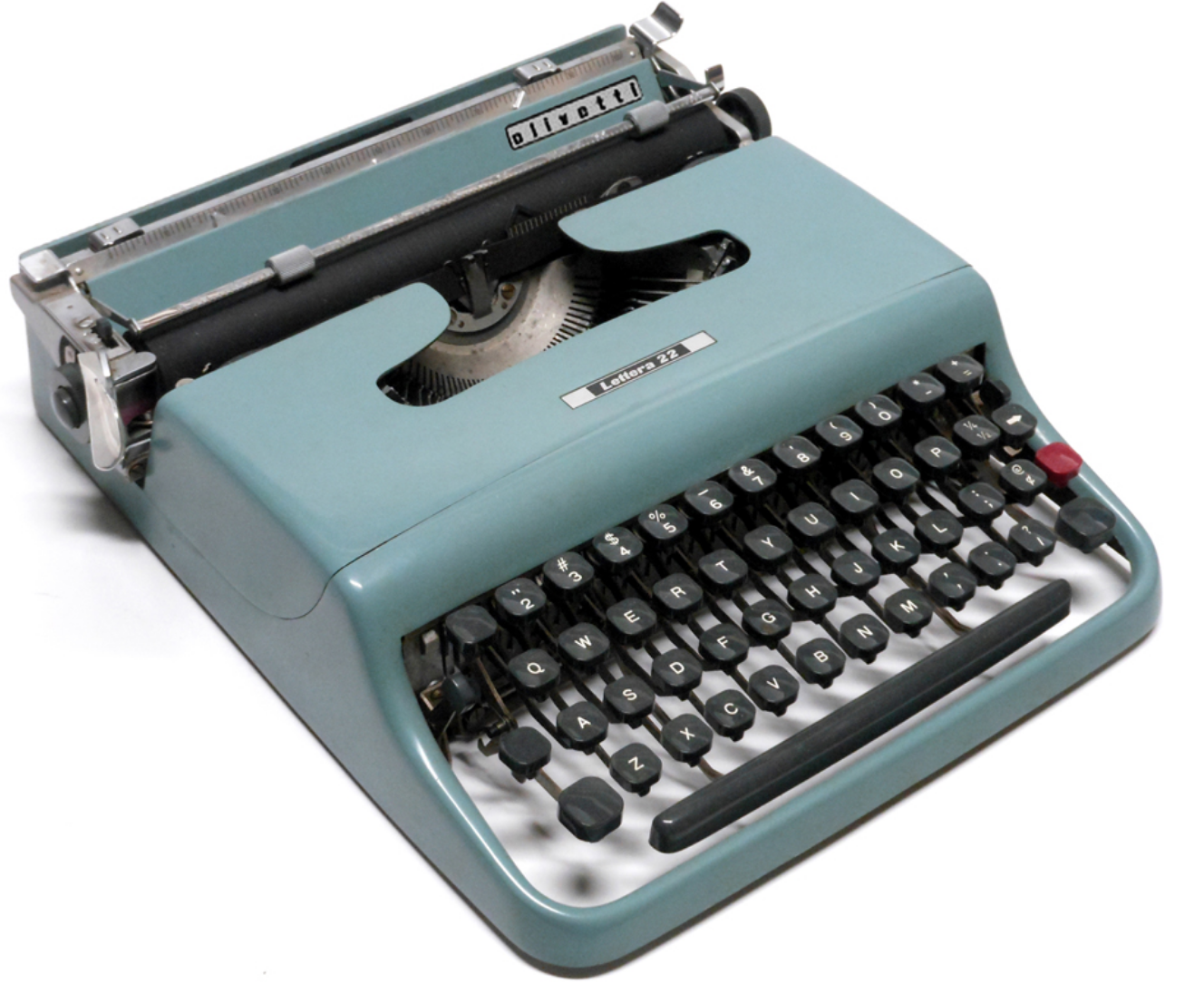
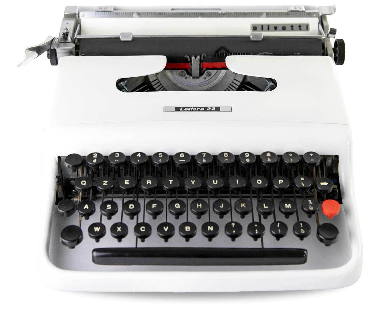
Lettera 22
Designed by Giuseppe Beccio and Marcello Nizzoli, this model replaces the MP1, but with many innovations.
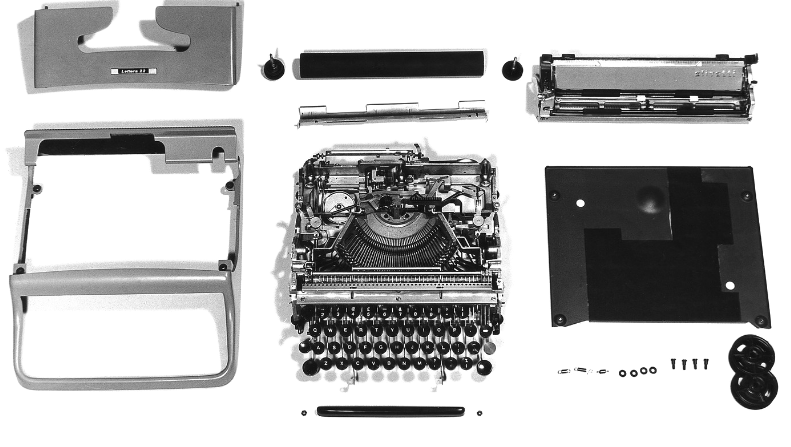
The keyboard is incorporated into the bodywork, as is the roller, of which only the knob protrudes; the footprint of the spacing lever is also minimal, to best meet the requirements of portability and limited space.

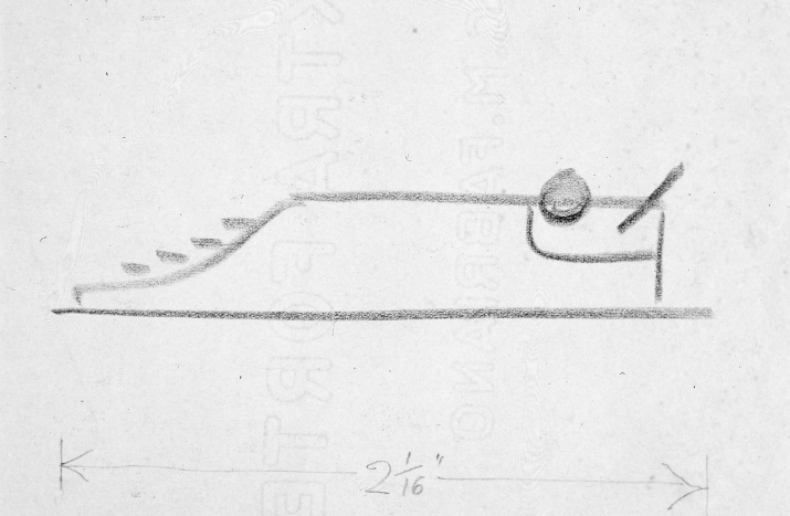
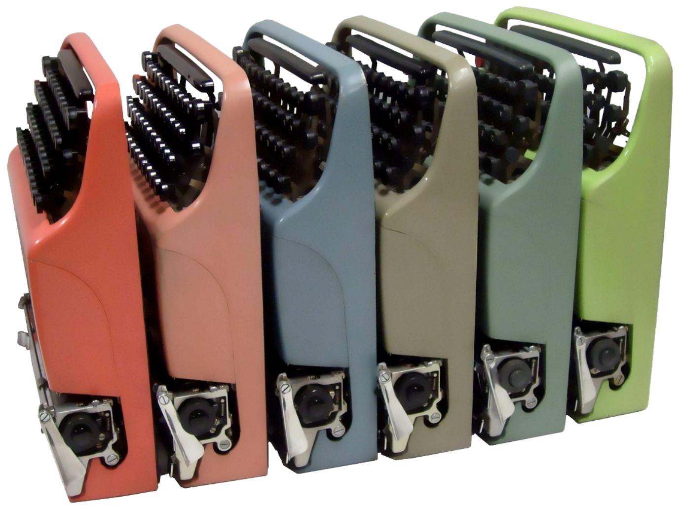
The machine, which measures 8.3 x 29.8 x 32.4 cm, immediately gives an impression of lightness and agility, although the weight, having to guarantee robustness and quality performance, is not indifferent (3.7 kg).
A case with a handle facilitates transportation.
Performance is excellent, thanks to the precision of the printing hammers and the kinematics designed to make pressing the keys lighter and more agile.
The keyboard has some limitations, due to the need to keep the size down (for example, there is no key with the number 1, which is obtained by using the lowercase letter elle), but the machine offers some functions (e.g. automatic change of direction of the movement of the inked ribbon when it reaches the end; return key; tabulation key; possibility of writing in red or black or even without ink to prepare matrices for mimeograph printing, etc.) that do not make one regret the much bulkier professional machines.


