Previous
Next

OT L22 Bold: a font inspired by the Lettera 22

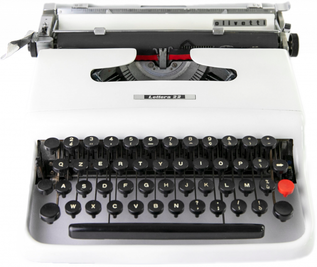
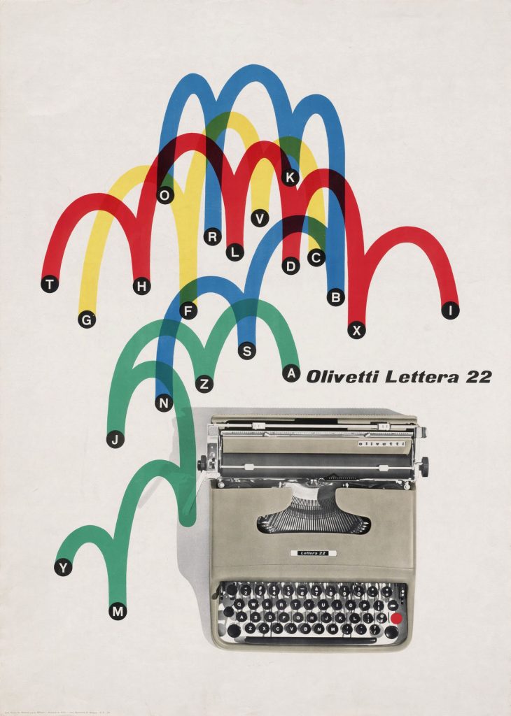
OT L22 is a type design project inspired by the founding principles of the Olivetti experience and style: Italian character, mobility, lightness and beauty.
The OT L22 Bold font can be used for print and digital media to fully meet to the needs of our time. Just as the Lettera 22 responded brilliantly to the needs of its time, becoming a faithful companion for writers, journalists and creatives.

On the occasion of the 70th anniversary of the introduction of the iconic Lettera 22, OT L22 commemorates the “Olivetti Style” that is now part of the genetic heritage of Italian creativity.

25 November 2022

OT L22 Type, released as the first version in bold, is now enriched with new character weights and a variable version. The homage to the Olivetti world and to the eternal Lettera 22 is now complete, thanks to new technical features, that can be used on any digital or traditional device, in response to today’s needs.

Font tester
font size

Light 200

Beauty inspiring confidence

Regular 400

Beauty inspiring confidence

Semibold 600

Beauty inspiring confidence

Bold 700

Beauty inspiring confidence

Available glyphs

I want Olivetti to be not just a factory but a model, a lifestyle. I want it to produce freedom and beauty because they, freedom and beauty, can tell us how to be happy!

OT L22 Bold and the Lettera 22 heritage

The OT L22 Bold font grew out of a cultural initiative documenting the heritage of technical drawings in the “Olivetti Design Characters” archival collection, maintained by theOlivetti Historical Archive Association. The font is distributed free of charge on the occasion of the 70th anniversary of the introduction of the Lettera 22, reflecting the sense of community awareness that underpins the Olivetti philosophy.

Conceived by Giuseppe Beccio and designed by Marcello Nizzoli, the Lettera 22 machine (1950 – mid 1960s) replaced the MP1, offering multiple innovations and some limitations that would not, however, lead you to mourn the much more cumbersome professional machines.

Celebrated writers and journalists would make the Lettera 22 an inseparable travel companion, and one which they would not relinquish even with the arrival of electronic writing. Many doyens of advertising graphics worked on the Lettera 22 posters, including Marcello Nizzoli, Giovanni Pintori and Raymond Savignac.

Inducted into the permanent collections of MOMA, the Museum of Modern Art in New York, and awarded the Compasso d’Oro in 1954, the Lettera 22 was chosen by the Illinois Technology Institute as the best designed product of the last 100 years (1959). Even the name “Lettera 22”, so simple, fresh and immediate, was designed to enter the everyday life of Italians and has played a role in its success: its driving force saw the machine dominate in all markets.

Stay up to date on the Olivetti world, subscribe to ours Newsletters!

Ricevi OT L22 Bold gratis

Iscriviti subito e ricevi gratuitamente la prima font ispirata alla macchina per scrivere Olivetti Lettera 22.

Una font unica al mondo. Stile, personalità, design.
Tutto questo è OT L22 Bold.